Terrari
Role: UI / graphic designer
About:
Terrari was born from the desire to offer peace and mental relaxation. Created as a gentle invitation to slow down, reconnect with nature, and embrace moments of stillness, the brand’s philosophy is deeply embedded in its visual identity.
Logo inspiration: The Terrari logo reflects balance and tranquility. Its structure is simple yet meaningful—drawing inspiration from the organic shapes of terrariums and the delicate interplay between nature and geometry. Soft curves meet clean lines, suggesting a space that is both nurtured and wild. The negative space gives the mark room to breathe, mirroring the brand’s emphasis on mindfulness and openness.
Colour palette: Terrari’s color palette is inspired by nature’s quiet hues—earthy greens, soft beige, warm clay, muted browns, and pale mineral tones. These colors are soothing to the eye and emotionally grounding. They reflect the peaceful atmosphere of forest floors, moss gardens, and natural light filtering through leaves. This palette ensures that all visual elements feel cohesive and restorative.
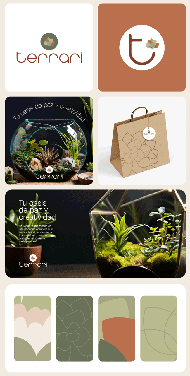
Photography Style: Photography for Terrari is slow, atmospheric, and honest. Images are softly lit with natural shadows and an emphasis on texture—glass, leaves, soil, water. Scenes are composed with space and air, allowing viewers to linger. Hands at rest, close-ups of living ecosystems, still moments captured mid-breath—these are the visual expressions of the Terrari experience.
Social media presence: On social media, Terrari becomes a digital refuge. The content rhythm is unhurried, offering quiet inspiration and visual rituals—morning light over a plant shelf, hands misting a tiny garden, short meditative captions. The tone of voice is warm, gentle, and thoughtful, aiming to soothe rather than sell. It’s not just a product showcase; it’s a curated mood board for slow living and mental restoration.