Dafne Ortiz Clarke
Role: brand / graphic designer
About: Dafne Ortiz Clarke is a seasoned business consultant specializing in strategy, innovation, and sustainable development. Her brand identity is meticulously crafted to reflect her professional ethos and the transformative impact she brings to businesses.
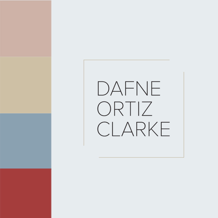
Logo: The logo embodies clarity and professionalism, featuring a clean, modern typeface that conveys trust and forward-thinking. Its simplicity ensures versatility across various platforms, reinforcing Dafne’s commitment to clear and effective communication.
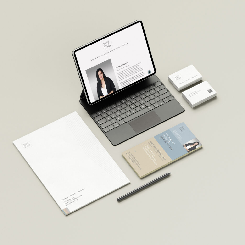
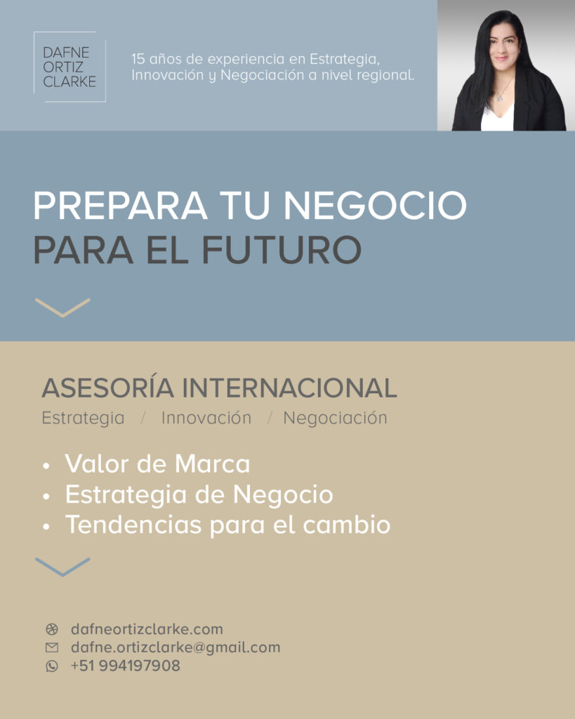
The visual identity for Dafne Ortiz Clarke extends seamlessly across her printed materials, reflecting her professional expertise in business consulting with elegance and clarity.
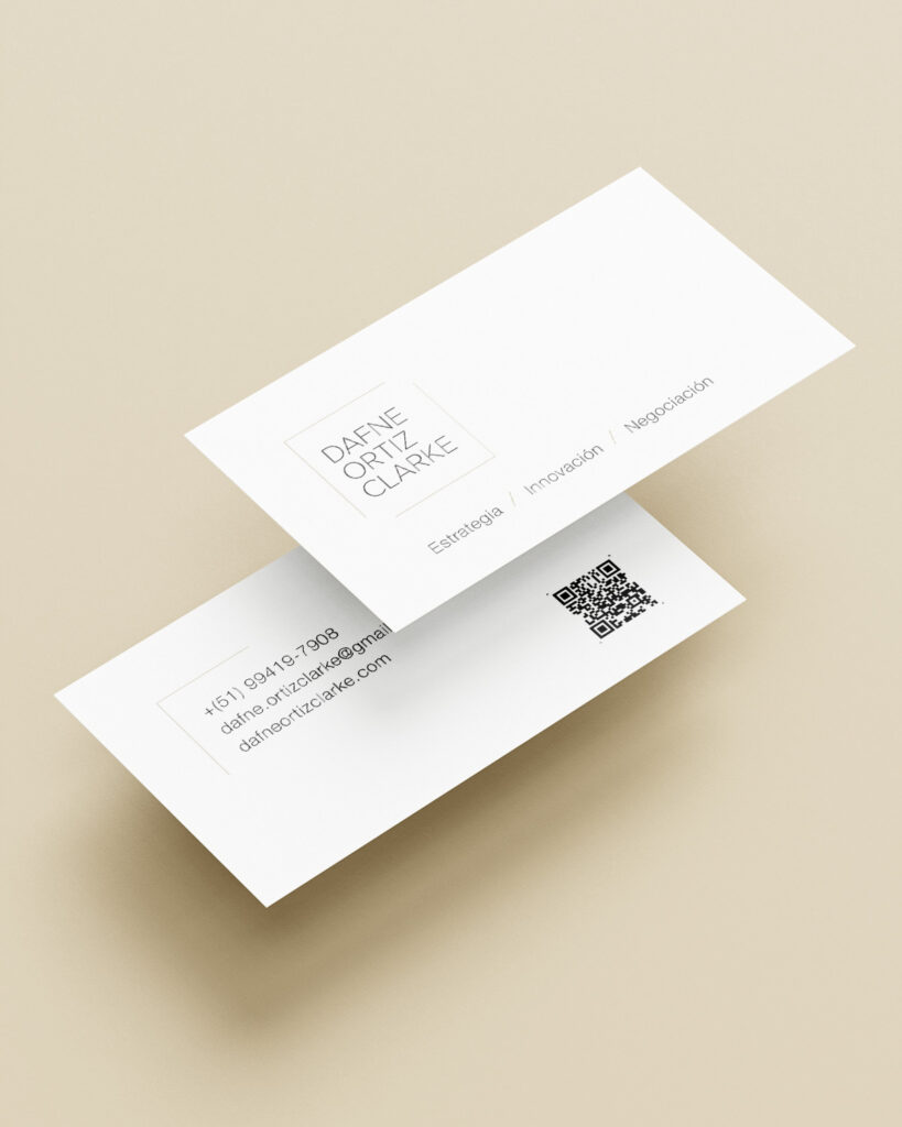
Business card: Minimalist and refined, the business card communicates confidence and order. The typographic structure, set within a fine-lined square, emphasizes her name with balance and precision. Subtle tones and clear hierarchy highlight her focus on strategy, innovation, and negotiation.
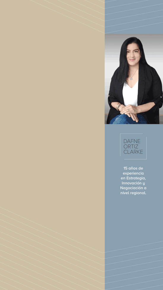
The letterhead is designed to convey professionalism with a clean layout and restrained use of graphic elements. The soft vertical lines on the right evoke structure and forward movement, while the muted color accents add warmth and distinction without distracting from the message.
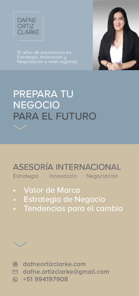
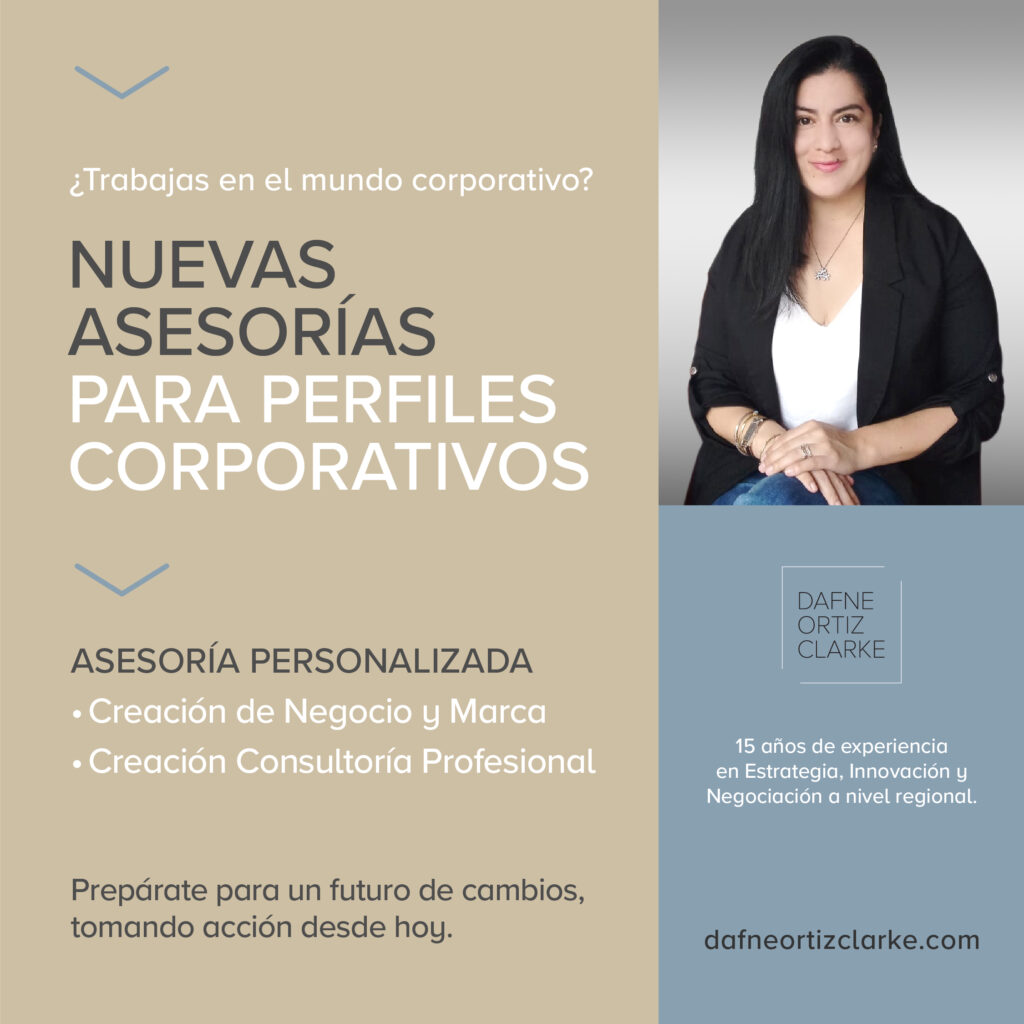
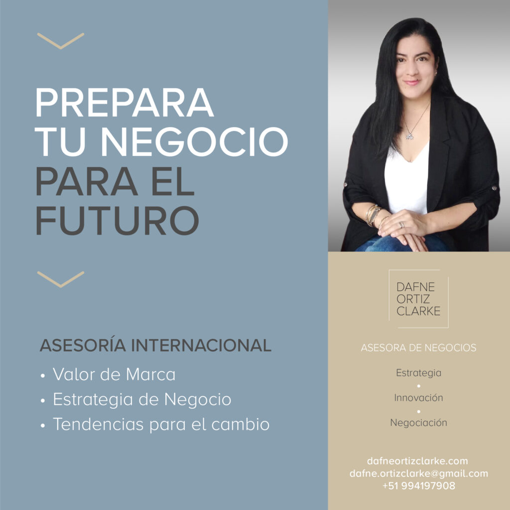
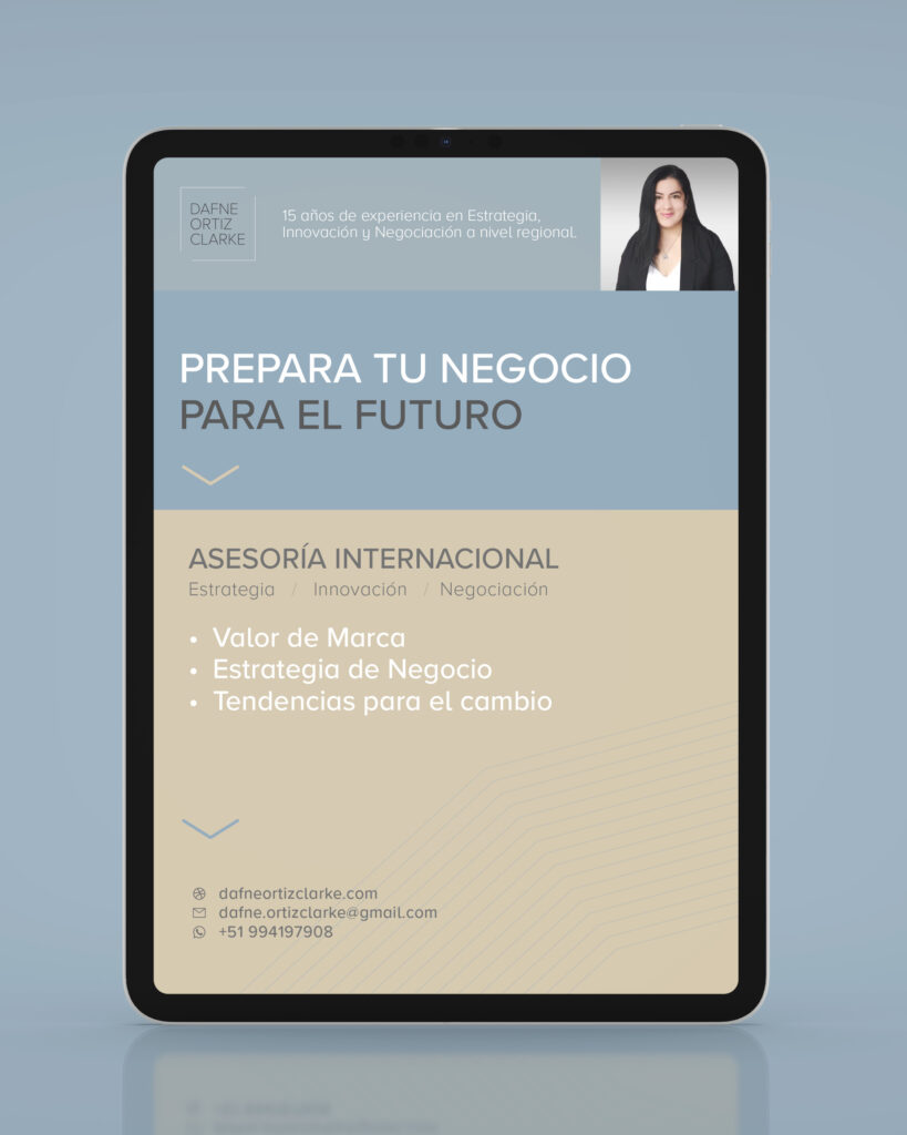
The flyer introduces Dafne’s consulting services in a friendly yet professional tone. With its muted blue and beige palette, strategic typography, and a professional portrait, the design supports her message of preparing businesses for the future. It effectively communicates her experience and international focus, with a clear call to action and accessible contact details.
Dafne Ortiz Clarke’s digital design embodies a clean, refined aesthetic that aligns with her strategic and professional brand. The use of soft neutrals, generous white space, and minimal graphic elements creates a calm, focused environment that reflects clarity, trust, and sophistication. Typography is carefully selected—combining modern sans-serifs with subtle serif accents—to convey both innovation and experience.
Every design choice, from layout to color and motion, supports a sense of thoughtful simplicity. Subtle animations and elegant transitions guide the user intuitively, while maintaining a sense of stillness and professionalism. The overall effect is a cohesive, elevated digital presence that visually communicates Dafne’s values of strategic clarity, sustainability, and transformative impact.